A step by step guide to creating an Infographic
Social media is becoming more visually oriented. Statistics show we remember 20% of what we read and over 60% of what we see.
Infographics visually represent complex information in a quick, simple and entertaining way.
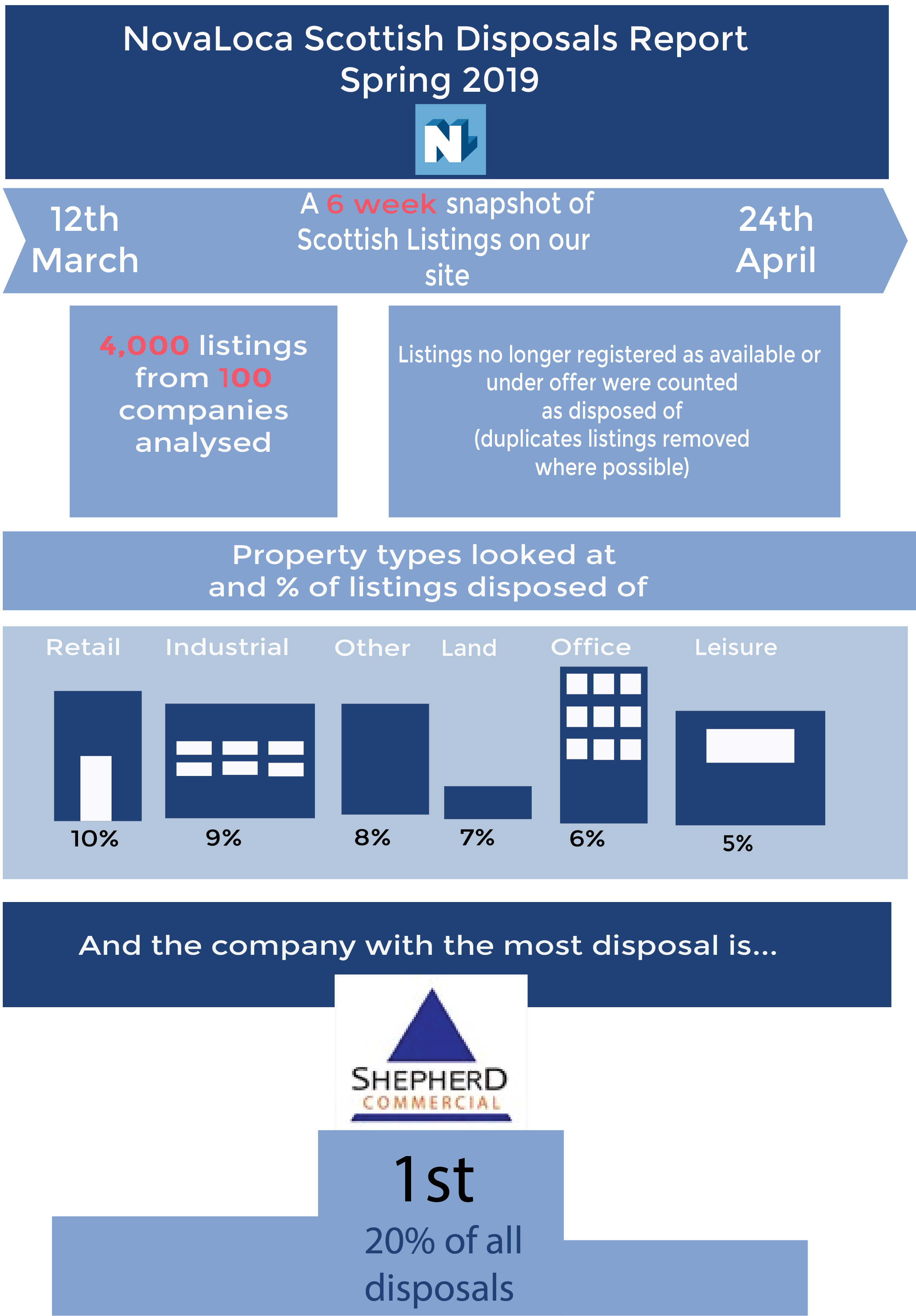
In this blog post I take you through a step by step process of how I approached a project that looks at a six week snapshot of Scottish property disposals on our listings site. I have used Adobe Illustrator for this project but you can use an online infographic maker with many offering free versions. Google Charts is a one such free solution.
The aim of infographics is to answer a question by providing the information the audience needs to answer it. This builds the framework for your design.
The information I wish to visualise is taken from our own database so I know the facts are from a credible source. This is a vital first check you should make for any information you wish to include.
I have 5 pieces of information to visualise which falls within the suggested amount of up to 6 pieces:
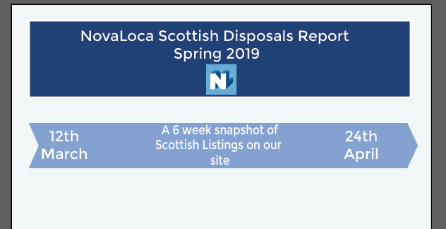
- A time frame of when the data was gathered
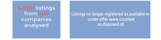
- The amount of property listings that were analysed
- The criteria we used for included listings in this analysis
- Types of property disposals
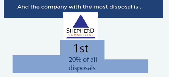
- The company who had the most disposals
If you have a lot more data you’d like to use you can include just a few pieces of information in your image and link traffic to a main piece on your blog
How do I lay out my information? Well, I know that half our visitors use a mobile device to look at our information so a portrait orientation will work best across multiple platforms.
I want to produce the graphic using our company colours. It is recommended you restrict yourself to three main colours. These colours also tie in with the colour of the Scottish flag and with the top performing company’s logo. Consider what colour scheme best suits the information you want to present and that it works well on a screen if it is to be used online.
Heading of Infographic
The first piece of information to add is the time frame. A simple arrow design can represent this. You don’t need to be constantly creating graphics. This arrow piece can be reused.
The next piece of information involves a fair amount of text so I’ve chosen just to encase this in boxes, highlighting figure information with a different colour.
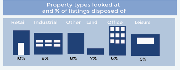
The types of property we looked at for this project had previously been represented in a graph but using very simple box shapes I have been able to show the same information in a more visual way.
And finally staying with the simple shapes I’ve shown the winner with the most disposals on a winners platform
Finished Infographic
Nice post author. Thank you. Keep it up.