Using Colour Psychology for Marketing
Colour can influence behaviour and affect decision making. Using the right colours for such things as web design, banners and listings can help you stand out and increase conversion rates by showing your audience what it is you want them to look at and what you want them to do.
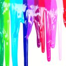
Here’s a quick rundown of some colour associations.
Green is associated with wealth, life, and the outdoors. It is considered the colour that is easiest on the eye and makes people relax. It is often used by health related brands.
Blue is calming and is associated with reason and wisdom. It is thought of as a colour to trust and is often used by financial institutes and offices. It is apparently the colour men prefer.
Purple is considered prestigious. It is related to superiority but also to excess.
Black links to luxury and power and is often used by high street brands. It can make items appear smaller.
White is connected to cleanliness, and is considered a fresh, modern look.
Orange is often used as a call to action as it is considered aggressive and impulsive. It is also associated with cheapness which of course may be something you wish to promote.
Red creates a sense of urgency so is good for sales.
Yellow associates with youth and happiness but it can be difficult to use as it needs a good contrast.
Remember that using contrasts reduces eyestrain and increases focus making an easy to read area. If colours are balanced and used in moderation they can make a big difference.