
If you only do one thing in marketing this year, get a mobile responsive website
Most of us now have a smartphone, iPhone or tablet alongside our desktop or laptop. The number of internet users searching for business information, specific products, industry information and trends has increased rapidly over the recent years. We now rely on the fact that we can gather this information from the internet whilst we are on the move.
Within the online business world, your website will not be limited to searches by consumers but also by business owners, competitors and potential investors or partners. Websites that are mobile responsive are becoming extremely popular and it is fast becoming essential that a business has a working mobile website. According to Think with Google, “65% of online consumers look up more information online now versus a few years ago.”
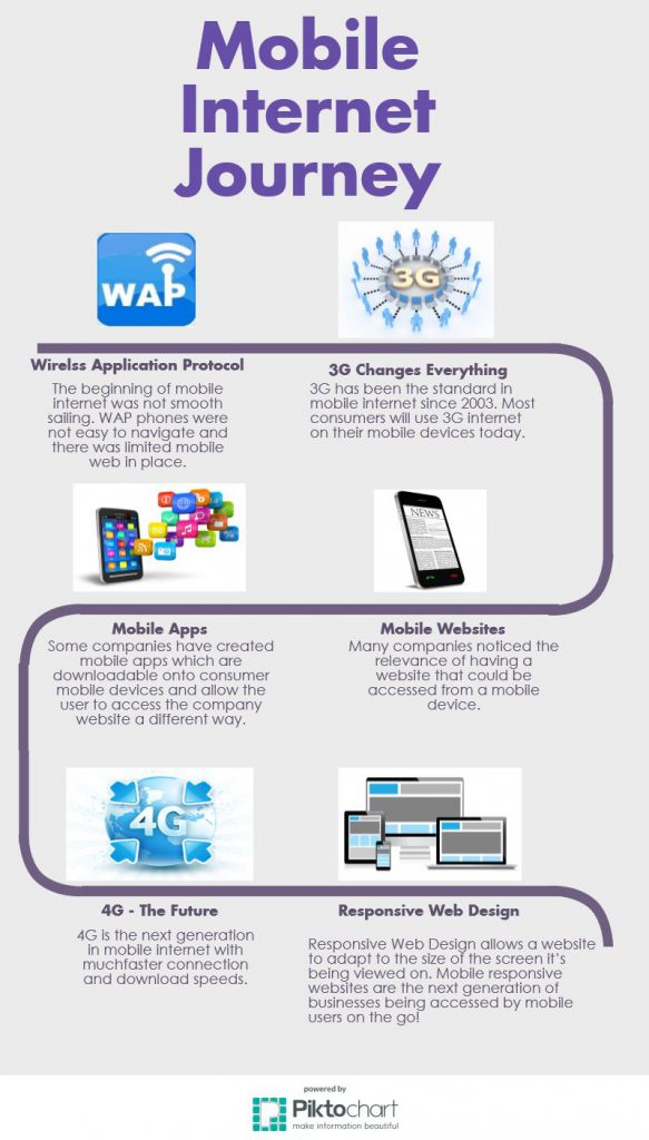
The chart below shows the journey we have been on with mobile data:
What is a Mobile Responsive Website?
Responsive Web Design allows a website to adapt to the size of the screen it’s being viewed on. This means that a website’s navigation options, page layouts, text, images and video media re-adjust themselves on a variety of devices. Responsive Web Design takes into account reformatting to give the user the best experience.
How Will a Responsive Web Design Benefit My Company?
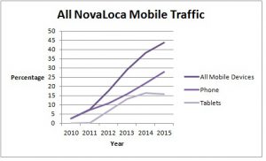
If you do not already have a website that is mobile responsive, then now is the time to get ahead of your competitors and make it happen. Last year we reported that over 40% of all NovaLoca property searches came from mobile devices, with figures for both smartphones and tablets on the rise. This has already increased to 45% in 2015 showing the constant increase in the use of our mobile website.
Take a look at the chart below to see the rapid increase in the traffic to our website from mobile devices:
 By switching to a mobile responsive site, you are taking away frustrations for users such as loading a large webpage, zooming, shrinking images and inability to click on links. Using a mobile responsive site, you can avoid these frustrations and keep users happy. Essentially this will positively improve your bounce rate as users are more likely to click through to other pages on your website.
Having a mobile responsive site will boost the opportunity for internet users to find your website when using search engines. Google are known for promoting the importance of having a mobile friendly website. Earlier in the year Google announced that around 60% of its searches now come from mobile devices, which shows the importance of implementing a mobile responsive website into your business strategy.
You do not have to worry about your website running properly on various mobile devices and can be safe in the knowledge that the website will adapt to the size of the screen and not the device which means you are future-proof when new devices are released.
Stay ahead of your competitors and ensure that your website is mobile responsive!
Did you know that NovaLoca can create you a mobile responsive agent website in just 1 week? Please contact Miranda Munn for further information on 01767 313 380 or zipbox@novaloca.com
[…] NovaLoca are proud and excited to announce that we have launched ZipBox – a commercial property template website. It’s fully mobile responsive, includes a content management system and a great search and display for your properties. Just recently, we produced a blog which details the great importance of having a mobile responsive website for your business. You can read this via the following link: http://www.novaloca.com/blog/index.php/2015/09/04/one-thing-marketing-year/ […]